

The current daily oral contraceptive market, often referred to as birth control, remains largely unreachable to those without easy access to insurance, specialized healthcare providers, or reliable pharmacy services, with only one over-the-counter option currently available.
Luna reimagines accessibility in contraceptive care by offering a cost-effective, sustainable solution that minimizes waste post-consumption while prioritizing a user-friendly and welcoming experience. This project explores the branding and packaging design for Luna, balancing function, aesthetics, and inclusivity to meet the needs of a diverse consumer base.
Packaging, Branding, Interdisciplinary Collaboration
2024


Since the current over-the-counter oral contraceptive market is currently extremely limited (with only one option currently on the market), looking to other products marketed towards women helped to provide a greater understanding of what aspects of a package are most valuable and appealing to shoppers.

In light of the current lack of easily accessible female contraceptive products and the persistent negative connotations surrounding the topic, several key areas of opportunity were identified as primary focuses for the project:
Speaks to consumers with warmth and approachability,helping them feel comfortable and at ease when purchasing a daily contraceptive.
Promote empowerment and wellness by creating a product that feels approachable and positive, helping to reshape the conversation around reproductive health.
Ensure the instructions are simple and easy to understand, so users feel informed, confident, and comfortable with how to use the product.
Make the product easy to incorporate into a daily routine, with thoughtful, accessible packaging that encourages consistent use.
Both the brand presence and packaging features are dominated by the delicate femininity associated with the elements of nature mixed with simplistic, delicate typography and soft colors. This will help to create a brand that feels both confident in itself, but natural.

The lunar cycle, which lasts about 29 days, is often compared to the average menstrual cycle, typically ranging from 21 to 35 days. Many cultures have historically linked lunar and menstrual cycles, citing the natural rhythm in women’s reproductive health that mirrors the moon’s phases. Luna will promote a friendly presence with overt references to the cyclic presence of nature. The team decided on a variation that highlighted the "u" letterform to emphasize the product's dedication to the user.

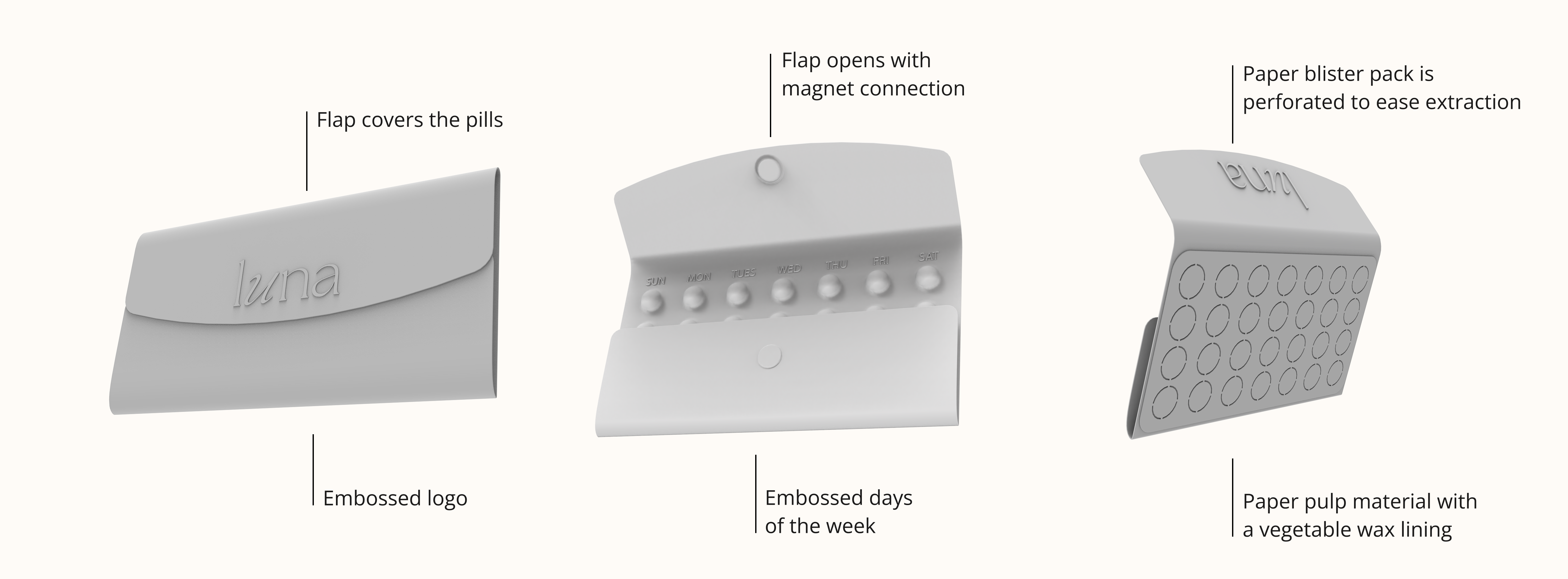
The greatest opportunity for innovation within the product's form lay in reimagining the traditional blister pack to eliminate end-of-life waste. This was achieved by integrating the protective outer shell with the blister structure, using biodegradable paper pulp to mold individual compartments for each pill. A vegetable wax lining was applied to seal the compartments, protecting the medication from moisture without relying on plastic.

The design process explored a range of visual directions, including abstracted representations of natural elements—particularly the phases of the moon—typography-centered layouts, and imagery inspired by the cyanotype printing method. The Luna moth was ultimately chosen for its symbolic connection to nature, transformation, the cyclical rhythm of life, and its connection to the nighttime.


Color played a key role in shaping the tone and accessibility of the brand. Several color harmonies were explored throughout the design process, beginning with a split complementary palette and later transitioning to analogous combinations. The focus was on balancing warm and cool tones in a way that maintained visual interest without making the product feel dark or intimidating.


